Choropleth map
Choropleth maps are used to represent ratio data by color ranges. Ratio data (rates, intensities or shares) is quantitative data calculated from stock data, which is either reported or calculated as a rate from a total.
They express the characteristics of the individuals observed, but their total has no concrete meaning.
Examples include population density, unemployment rate, mortality rate, etc.
Paramètres lors de la création de la couche
When creating a choropleth layer, you need to provide the following parameters:
- The variable to use for the choropleth representation,
- The classification to use and the associated colors,
- Whether or not to display a summary chart of the data classes,
- The name of the resulting layer.
The classification can be chosen via a shortcut to the main methods (Jenks, quantiles, etc.): in this case, the default palette is the YlOrRd palette from ColorBrewer and the number of classes is calculated automatically.
It is also possible to open an advanced settings window to choose from other types of classification and from a wide range of color palettes.
Examples
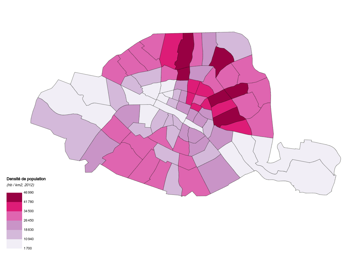 Choropleth map of population density by neighborhood in the city of Paris
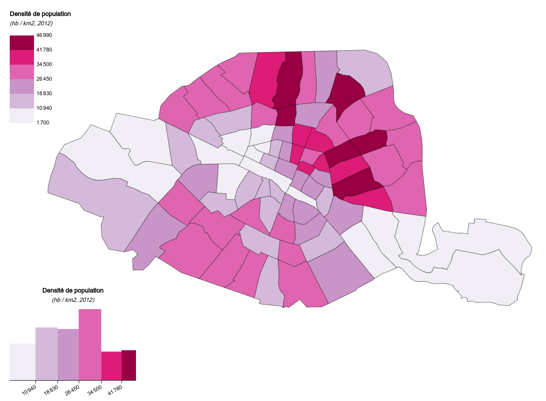 Choropleth map of population density by neighborhood in the city of Paris (with histogram)