
Bivariate choropleth
Bivariate choropleth maps allow two relative quantitative variables (rates, densities, proportions) to be represented simultaneously on a single map, by assigning each spatial unit a color resulting from the combination of the values of the two variables.
Unlike classic choropleth maps, which are limited to a single variable, this approach offers a synthetic view of the spatial interactions between two phenomena, revealing typical profiles or shifts that would be difficult to see on separate maps.
This type of representation is particularly useful for exploring complex relationships between two variables, such as the association between obesity rates and diabetes rates, between education level and unemployment rate, between the number of rainy days and total precipitation, etc. Bivariate maps allow direct visualization of correlations, oppositions, or independencies between the two dimensions.
Functioning and proposed options
Each variable is classified into three classes (low, medium, high), according to the chosen discretization method (Ckmeans, quantiles, equal intervals, geometric progression, manual choice, etc.), with the possibility of reversing the order of the classes for one or the other variable.
The final map uses a bivariate color palette, generated from two univariate color progressions. The color of each spatial unit then results from the mixing of the two palettes, depending on the classes to which its values belong for each variable.
To ease interpretation, two legend elements are offered:
- A 3×3 matrix legend (nine boxes) that presents all possible combinations of classes between the two variables, with their associated color.
- A summary graph in the form of a scatter plot with a 3×3 grid, optionally indicating the number of spatial units in each combination of classes.
Example
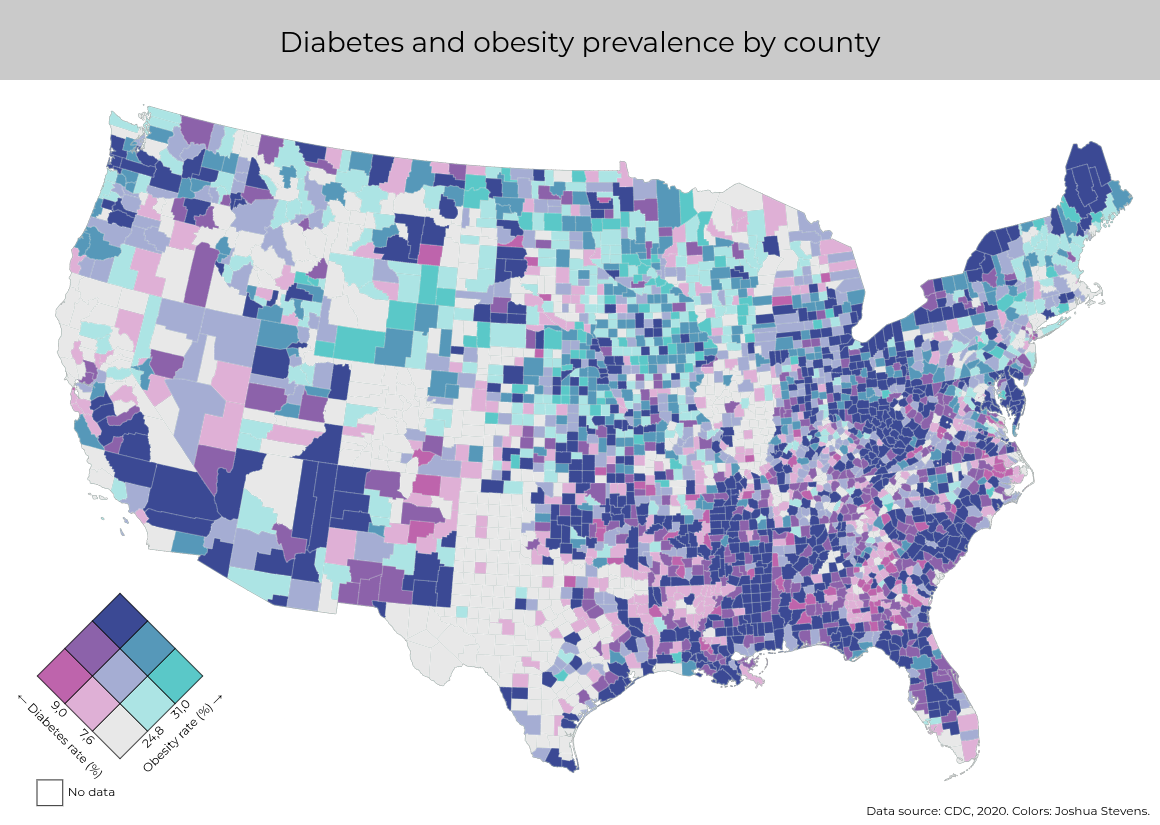 Example of a bivariate choropleth map (diabetes and obesity)
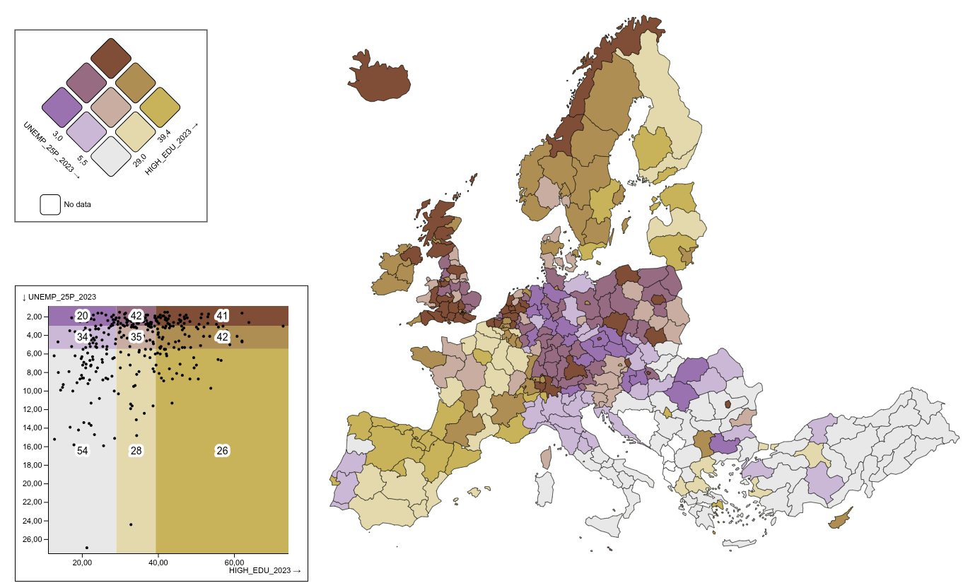 Example of a bivariate choropleth map (unemployment rate of those over 25 and share of the active population with a high level of education, 2023)
Limits and alternatives
Bivariate choropleth maps have certain pitfalls that should be taken into account. First, their visual complexity can make reading difficult for an uninitiated audience. The nine color combinations, even if well-chosen, require more interpretive effort than a univariate map. It is therefore recommended to systematically accompany the map with a detailed legend and, if possible, explanatory text to guide the user.
Next, this type of representation assumes a relevant relationship between the two chosen variables. If they have no logical or statistical connection, the bivariate map can generate false interpretations, suggesting correlations where none exist.
If the data or audience are not suitable for a bivariate map, it may be preferable to compare two univariate choropleth maps side by side (or to use small multiples if more variables need to be represented).
In other cases, if a causal relationship is suspected between an explanatory variable (independent variable, or predictor) and a dependent variable (dependent variable), it is possible to use the tool for mapping the residuals of a linear regression.